I had to reboot my computer the other day and while the computer was starting up I noticed that my primary monitor wasn’t correct. One of my monitors is rotated 90 degrees, and normally the boot sequence is shown on the non-rotated display, because… well, tilting my head ninety degrees to view the screen kind of sucks.
So I swapped the cables around, and went back to work.
And then… Wait a minute. These colours aren’t right. And… neither are these? What the hell?
Colour management on computers is devilishly tricky. Every monitor is slightly different, and the utter agony that must be endured when you want things to look even similar in two places is incredible. Ask anyone, it’s mind blowingly bad. I have a good setup that’s been working for a long time. All my apps know about my colourspace, my monitors are dialed in, and Windows knows what’s what.
But when I swapped the cables around, Windows got confused and chucked out the colourspace configuration. And so what I saw in one program was subtly different in the next, and more different in the third, etc. And what happened was my edits were completely fucked up.
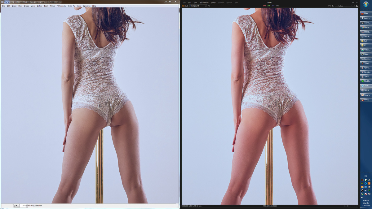
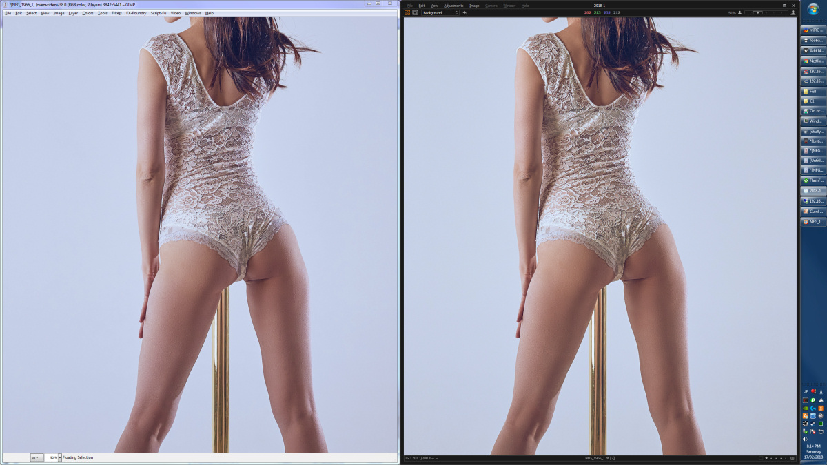
Check out this screenshot, of three different apps. The RAW photo on the left became a little redder in my editing app, and the viewing app made her look sunburned. Normally these are identical.
Since I’ve finished these images, saved them and closed the editor, they’re locked in stone. The only way to get the correct colours back is to either re-edit them from scratch, or take the final edit and try to re-adjust it to match the one image of three that looks correct.
Holy fuck, what an ordeal. Contrast, white balance, tint, contrast, brightness, black level, shadow colours… Everything’s different.
Here’s what I’m starting with. The ‘correct’ version is on the left, but it’s in the wrong colourspace, and so viewed on another app, I get the one on the right.
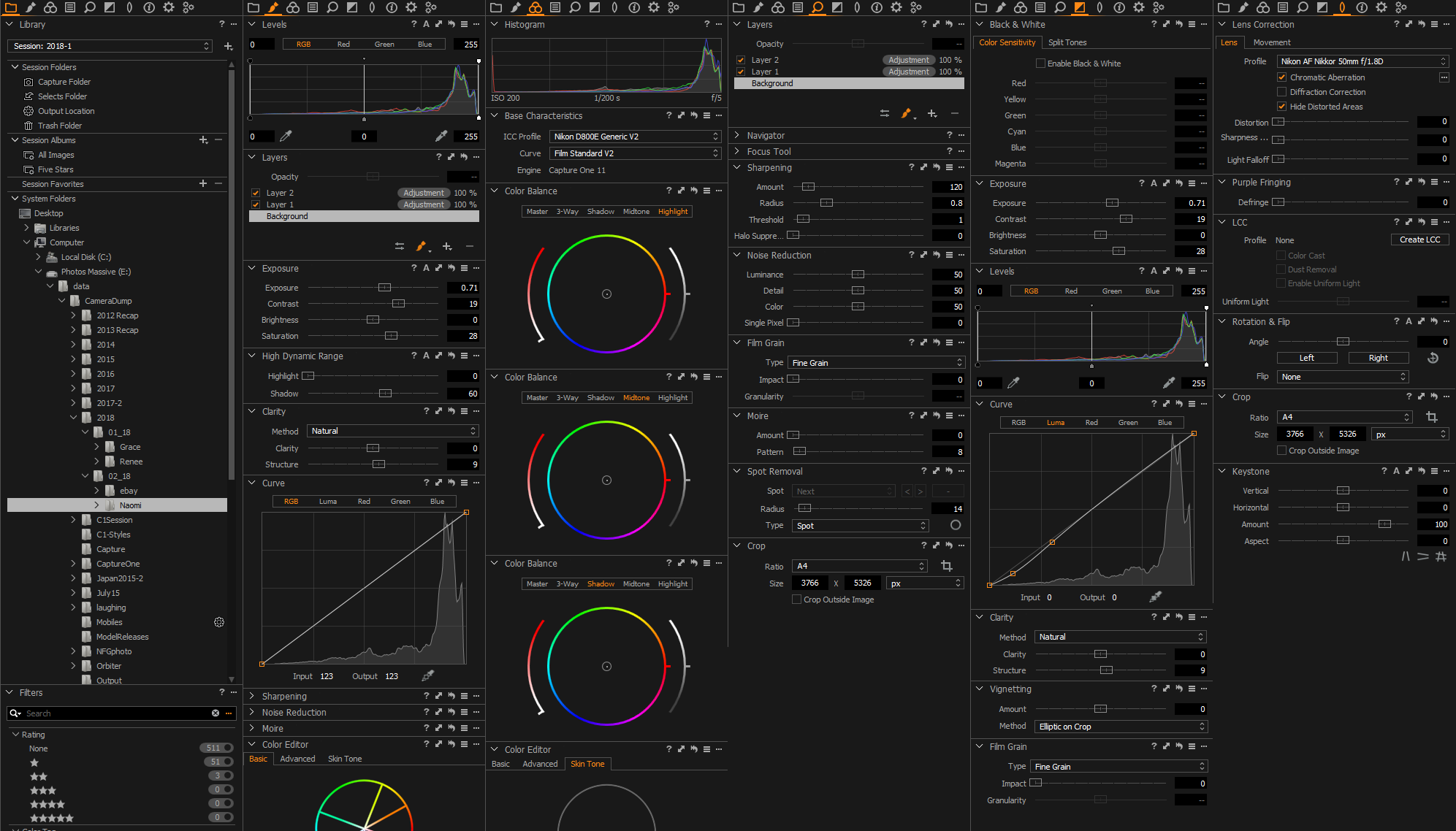
And after carefully hammering the shit out of every slider available to me (and that’s rather a lot, really. Have a look. Airline pilots are impressed.) I’ve got it close to where it should be:
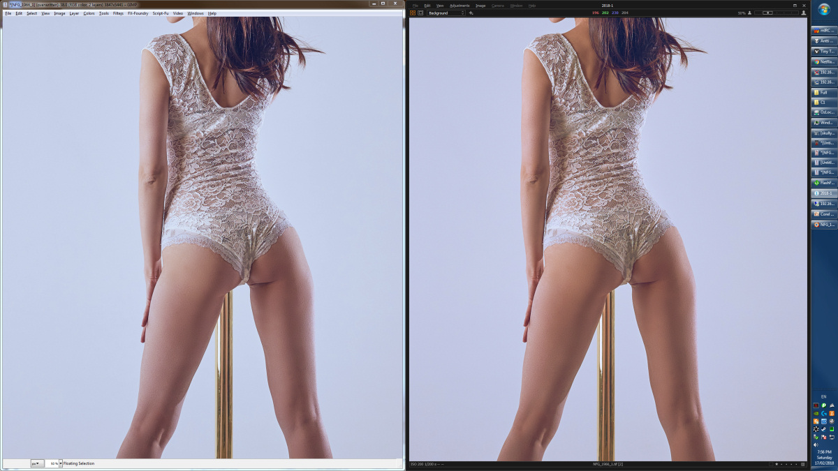
And you can see that it’s really, really close. But when I start comparing the colours up close, it’s not right. Too much green here, so I adjust the green, but then there’s too little blue somewhere else. So now there’s more blue in the shadows and highlights, but more yellow in the middle tones, and less contrast… cool the white balance no heat it up a notch… down a smidge… Now the tint, tweak the shadows, drop the saturation, bring up the highlights a bit…
And it’s about as close as I can make it. They’re still obviously different, but it’s much, much harder now to say exactly what’s changed. The only thing I’m sure of is that these video cables are going to be glued into place, forever.
After all that I’m not really sure I saved any time. I probably should have started the whole process over.
Sigh.
