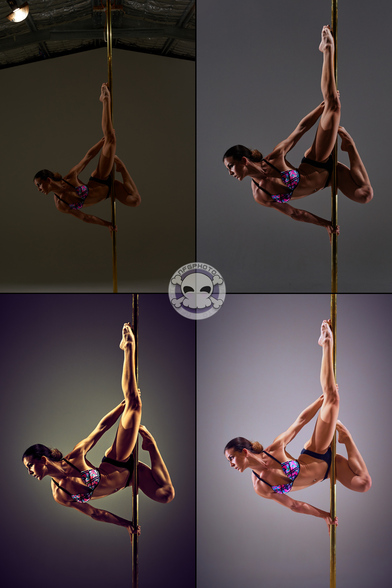
Sometimes I go back through older images and re-process them with my modern preferences and techniques, and the differences are often striking.
Consider the image below, featuring Vanesa, taken in December 2014. The image on the top right is the original, unedited shot. On the top right, the final edited image delivered to Vanesa. It’s dark and powerful, and very much my older high-impact style.
Eleven months later, in January 2016, I edited the bottom left image, and I’m way happier with that one than the first.
But then, two years after that, the bottom right image was re-processed in January 2018. It’s totally different from the last two, but as of right now, this is the sort of image I prefer to create. It still has all the light and shadow needed to show off Vanesa’s hard-earned muscles, but has a more even tone instead of the super-dark shadows of the previous two. You can actually see her. I also like that the colours are more subtle, still tweaked with some extra blue here and there, but looking more like skin colour.
And, if you look closely, you’ll see that the first and fourth image are not actually the same as the other two – I grabbed the next one over in the session folder. Oops. Shhhh… ^_^


