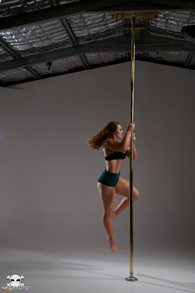
Yesterday I had a shoot with Nomes, and I tried out a new lighting setup based on her ideas, and it worked really well. From the raw image I went for a super saturated look which made her skin and beautiful green outfit really pop against the grey background. I’m very happy with the result. Here’s the unedited starting point:
Today I had a shoot with another client who wanted a dark, edgier sort of vibe, and I thought I could use the same lighting configuration with a different treatment. The client didn’t think Nomes’ pics were quite what she wanted, so I quickly ran off a new version.
Here’s a comparison of the two styles. I really like that I can take this same starting point and push it in two entirely different directions.


 Unlock with Patreon