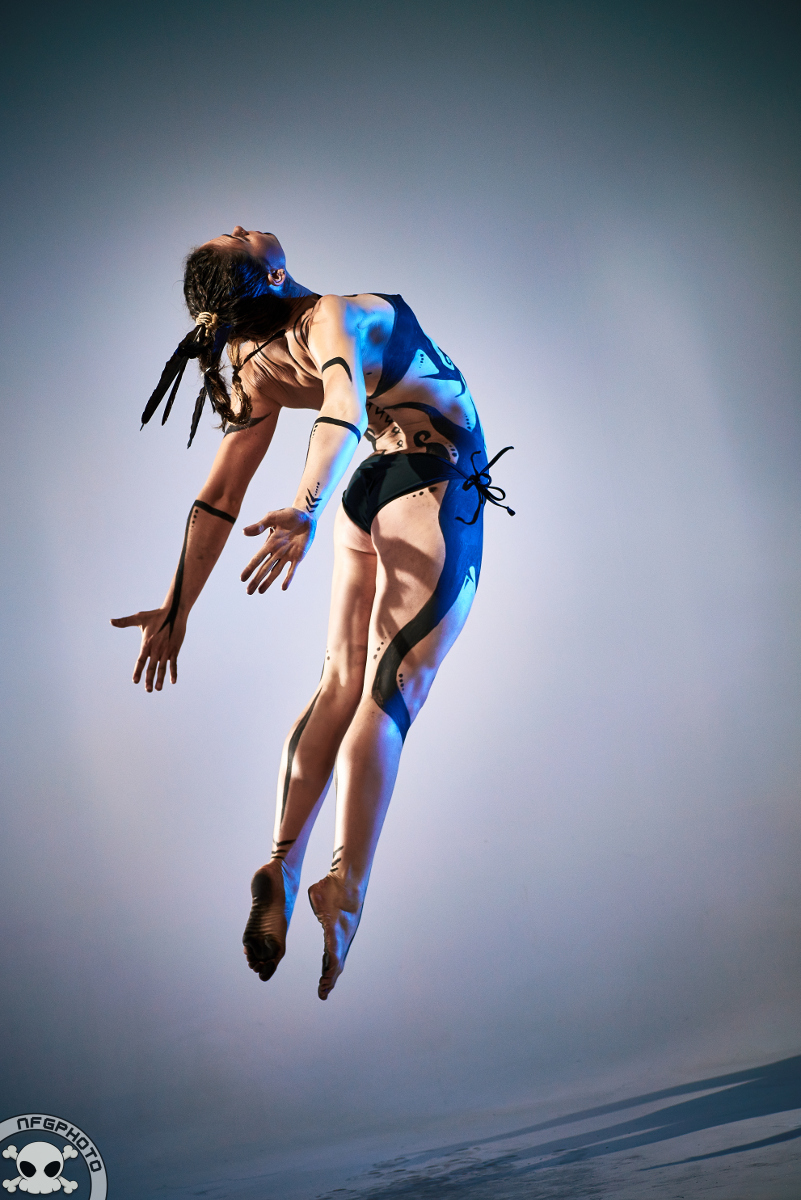
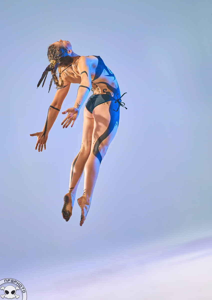
I’ve been prepping a bunch of images for the Asher Wednesday series, and once again I find there’s a fairly significant difference between my old editing style and my new style.
The original has much more contrast, the new version is more subtle. There’s also a lot more space around Asher in the new version, which is something I’ve only recently started doing.
Here are the two images. What do you think?


